Credit Card Shopping Experience
USAA 2017
The challenge: "Humanize and soften the credit card decline and counter offer moment"”
This was the ask our design team received from our key stakeholders. At first glance, it seemed the ask would be to redesign a single screen. Upon further examination of the decline/counter offer experience, there was a realization of a potentially more significant issue— that decline/counter was a symptom of the more significant problem.
Members were not accepting the counteroffer because the process of finding the right card and then navigating to the application was long and confusing. To get declined for a card was a punch in the gut— then to get a counteroffer was salt in the wound. This realization was the birth of a new effort. By looking at the entire experience and understanding the human needs of looking for a credit card, we sought to design an experience that could prevent a decline experience.
User interviews allowed us to go into more depth and truly understand the motivations and thought processes behind member behavior when it came to shopping for credit cards.
We used card sorting to understand what people care about when shopping for a card and to explore misconceptions and general understanding (or misunderstanding) around cards and good credit management.
Once we had a shared understanding of our member's needs, we aligned around the different ways in which we wanted to meet those needs by crafting Value Statements. which were to act as the north star within the organization – succinctly describing what we must build and how we can measure success.
Ideation + Concept Exploration
Referencing the value statements, the team took the time to ideate and sketch ideas that would solve these problems. Through the method of divergent and convergent thinking, we sketched, evaluated, compared, and consolidated a limited number of solutions to select for prototyping and testing.
Concept Validation & User Testing
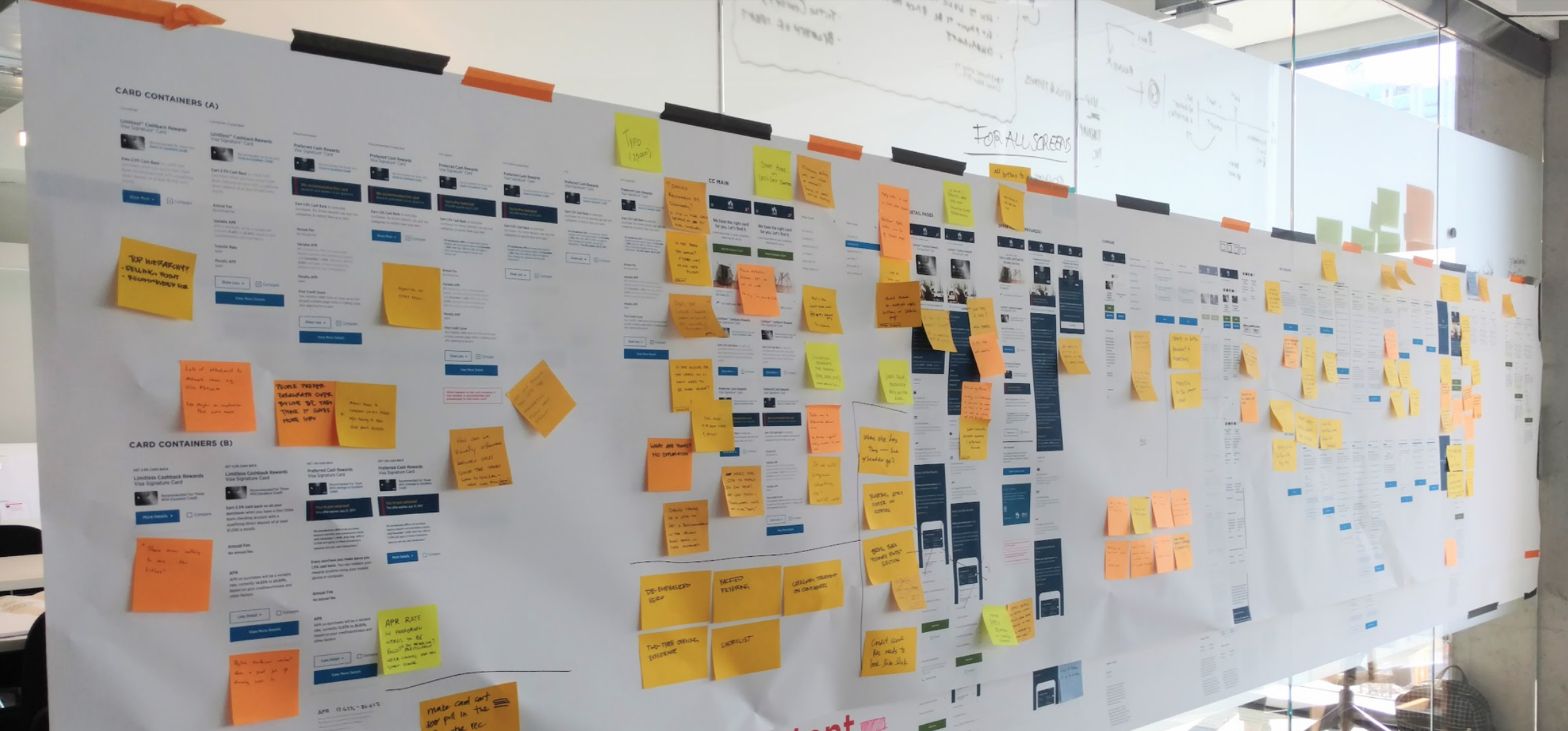
We recruited and tested many low-fidelity concepts with members and prospective members to see which resonated the most and why. We captured our observations and made sense of our findings through the process of synthesis. These insights would lead to a gradual refinement of our design.
Outcome
The result is a Credit Card shopping experience that results in a USAA Member browsing card products confidently understanding the best card for them based on clarity of information and understanding card features and which card fits their needs.
*Product Recommendation Concept, “Help Me Choose” feature is currently patent pending.


